Product: Website Role: UI/UX Designer
TeleMed
TeleMed is a cloud-based SaaS software that helps medical industries store and locate sensitive test reports and patient files more safely and securely.
Opportunities:
Improved usability across the platform: We implemented a variety of accessible features (WCAG Level AAA compliance, alt-text, closed-captions) to help people who have visual and auditory impairments navigate the site more easily.
Improved navigation and information architecture: The revamp focused on enhancing navigation and information architecture, streamlining the user journey through intuitive design and logical content organization.
Establishing a new design system: streamlines the development process, ensuring efficiency, consistency, and quality control.
The Issue
At first glance at TeleMed, there was a variety of links and resources the user can tap into for a variety of help; however, it was unclear what TeleMed’s purpose was and it was also difficult navigating through the interface as there was repeated info and menus—creating a maze-like structure for the user.
The Goal
TeleMed's aim is to refresh their brand and updat their UI to make users feel more welcomed when they first land on their page. Their main goal is to advertise ViTELflo, a product that documents patients’ tests, reports and other sensitive information within a single cloud system while abiding to WCAG and AODA's guidelines.
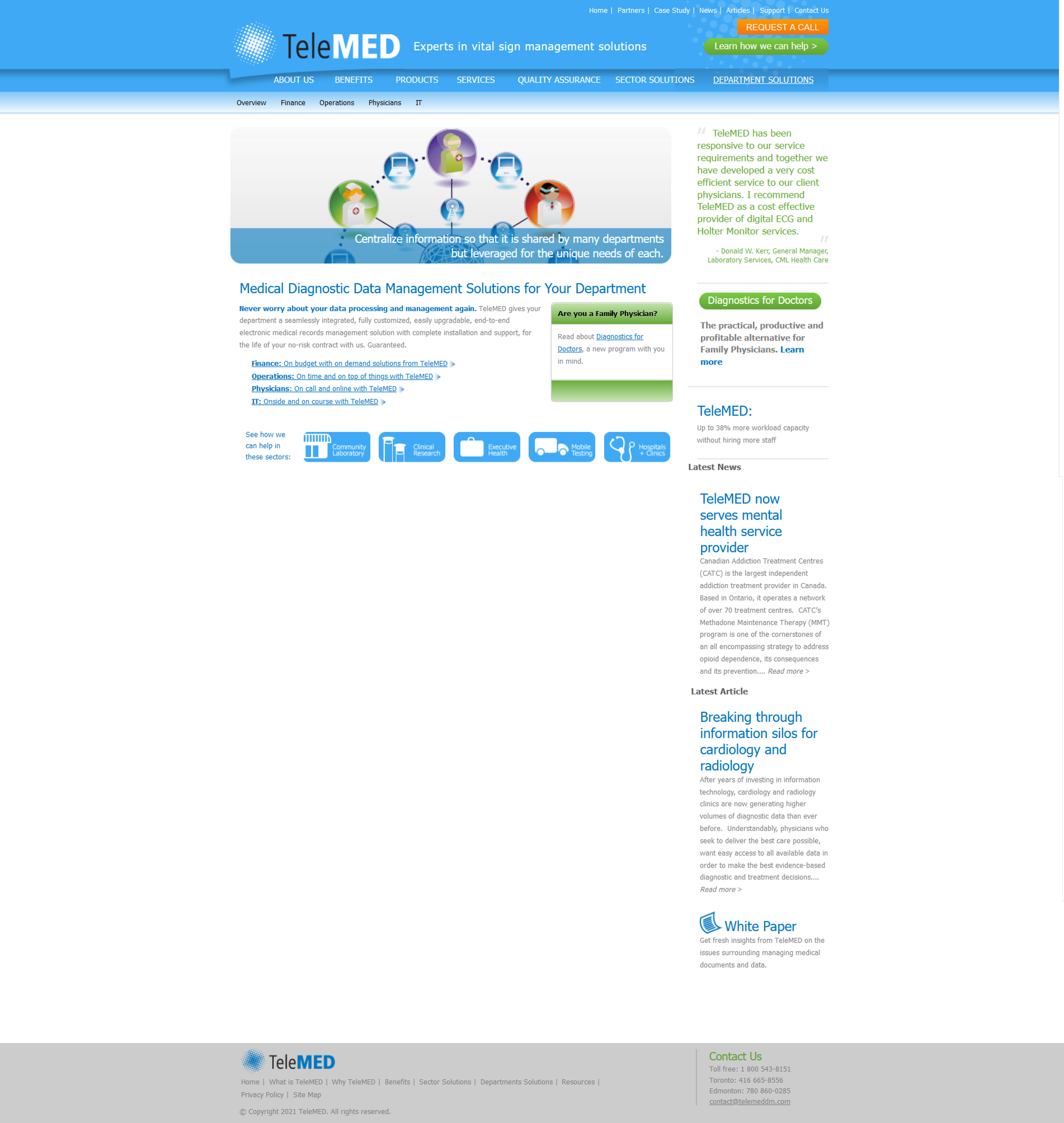
TeleMed’s original website design
User Research
Through conducting user interviews, we discovered two key findings.
-

Difficult Navigation
Users found it difficult to navigate through the website and find the necessary information.
-

Lack of Credibility and Reliability
Users found the credibility and reliability of the company to be questionable as it looked outdated.
Brand Refresh
TeleMed’s brand has been simplified to using a monochromatic palette with a strong cobalt blue in contrast to light greys and blacks to give a calming effect.
TeleMed was looking for a unique set of icons to accompany their new refresh. I kept in mind their colour palette and soft depiction of healthcare to create a set of outline icons with a subtle gradient.
Images of objects have been updated to photographs of physicians working to give a more personal and welcoming perception while also keeping images of objects in the brand when necessary. Each photograph has also been slightly modified to match with TeleMed’s new colour palette to create a more synonymous brand.
Based on the pain points, a site map was created to help users navigate the website more easily alongside a re-brand to improve the credibility.
Stakeholders and KPIs
During meetings with the stakeholders, we discussed the main KPIs that they wanted to improve on, which included increasing user satisfaction, increasing task completion rate, and lowering bounce rates. With that in mind, TeleMed decided to shift its main focus to advertising its cloud computing software, ViTELflo and marketing its solutions towards clinics and labs.
Wireframing
Using Figma, low-fidelity wireframes were created to visually show how each layout will look like as well as help test the proposed layout before further advancements were made. The aim for this project is to ensure that the information is laid out in an order that gives context as to what ViTELflo is and how it can further help the workflows of medical professionals.
Design Systems
TeleMed’s design systems were made with varying buttons, typography and colours as components on Figma. Each button varied in size, color and functionality, typography was previously laid out to guarantee that the appropriate typeface is used before low fidelities were made and colours were also set to ensure that the correct color codes are being applied.
Condensing Information and Increasing Engagement
TeleMed had a large amount of information to work with. To guarantee that users were not overwhelmed while also making the website more engaging, certain sections were condensed and made more interactive. This was achieved by using sub-menus which hide and show pieces of information when clicked on.
Accessibility Design
To ensure that the website is fully accessible and inclusive, contrast checks have been implemented for text and colour, alt-text descriptions for images, as well as colour-blind simulations to guarantee individuals with visual impairments will be able to navigate through the site seamlessly.
Discussing with the developers, keyboard functionality was set in place to allow users to tab through each section without using dexterity skills when using a mouse.
Responsiveness
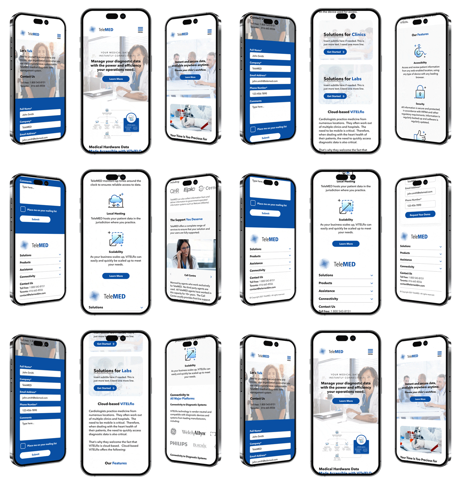
Multiple user interfaces were mocked up on Figma for mobile, tablet, laptop and desktop sizes to ensure that the site is responsive through all platforms. This visual aid also helps the developer know how the layout will change throughout the various sizes as well as what key elements will look like when shrunken down to smaller sizes.
Results
Simplifying the user interface, TeleMed’s brand was revamped into a more modern and reliable firm, where the bounce rate of the website dropped to 4.5% after its initial launch. A large majority of the users were able to find out what perks and features ViTELflo included and how it worked as well as finding further details on the product when prompted as the second round of user interviews was conducted.
-

Reduced bounce rate to 20.5%
-

Launched in less than 3 months
-

User Satisfaction Rate
-

Task Completion Rate
Key Takeaways
Create a strategic plan to organize information architecture: Organizing information architecture helps clarify navigation making it easier for users to get to where they need. Build a strong foundation before starting on the nitty gritty.
User testing doesn’t end after development: Design is a constant iteration of improving the experience for the user. Always find ways to collect and listen to your users’ feedback.
Credibility through first impressions: First impressions always matter to foster trust and credibility of a brand. If a brand doesn’t look credible, people will stay away and question how reliable their products are.


