Product: Mobile App Role: UI/UX Designer
OpenRace
OpenRace is an online app platform that brings people together through social virtual racing experiences.
Opportunities
Establishing a new design system: Streamlined the development process, ensuring efficiency, consistency, and quality control.
Improved usability across the platform: We implemented a variety of specifications, which included visual, auditory, and tactile features to create a more inclusive and accessible app
Executed end-to-end: As a freelancer, I was fully immersed in the OpenRace project, executing all stages from conceptualization to deployment. This end-to-end involvement ensured a cohesive product and offered a deep understanding of the project.
The Issue
As we spend more time on technology, the motivation to play sports or exercise has decreased. Despite wanting to have a healthier lifestyle, people may not find exercising to be the most enjoyable activity.
The Goal
Our goal is to create a community and environment that encourages physical activity and an active lifestyle. We make exercising more enjoyable and fun by allowing users to race against people from all over the world to win tangible prizes and sponsored merchandise.
User Research
As user interviews were conducted, the major pain points to maintaining an active lifestyle we found included:
-

Lack of Motivation
Exercise is not always fun and results are not immediate.
-

Cost of Gym Memerships
Gym memberships tend to be quite expensive as monthly and yearly subscriptions add up.
-

Finding a Community
It was difficult finding friends who have a love for jogging and want to maintain a regular routine.
Based on these pain points, card sorting and tree testing were put into place to determine how users tend to navigate.
Stakeholders and KPIs
Our primary goal was to achieve high user satisfaction and a high task completion rate. To achieve this, we aimed to design the app to be simple and straightforward. We also wanted to address the pain point of maintaining motivation for an active lifestyle. To counteract this, we brainstormed the idea of rewarding users with incentives such as in-game currency that can be exchanged for discounts, online coupons, and tangible products.
UX Design
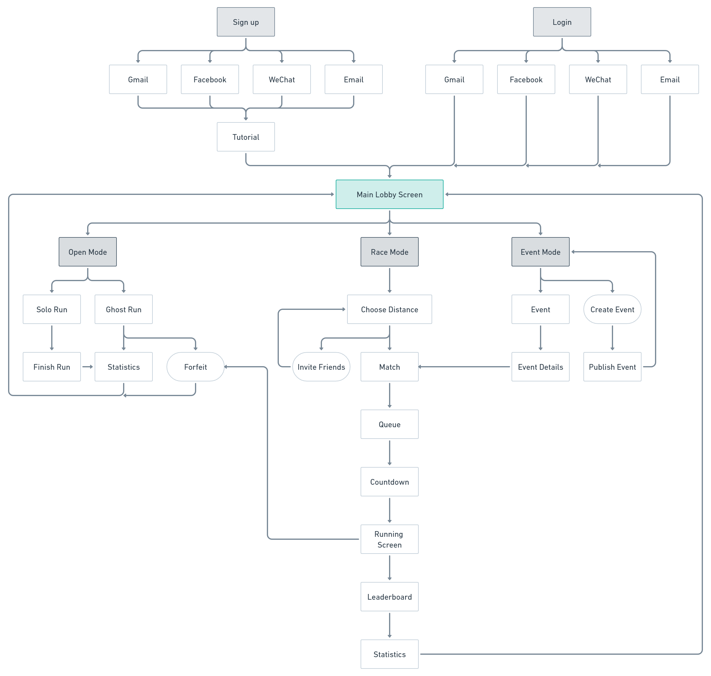
A site map was made to show how each screen will transition based on the options the user may choose. Initial wireframes were made with marker and paper and then finalized in Adobe Illustrator. The aim of the UI interface was to make navigation as easy as possible and intuitive to use.
Dashboards
Adobe Illustrator was used to create low-fidelity wireframes that visually depict how each layout will look and help test the proposed layout before proceeding further. The main page consisted of three racing options: running solo, racing in a group, and competing in events and competitions internationally.
Design Systems
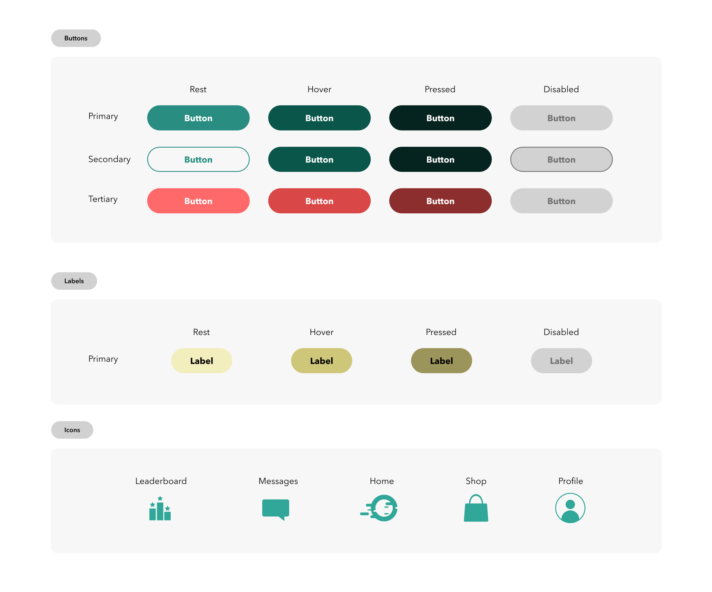
OpenRace’s design systems were made up with various sizes of buttons, colors and typography as components on Sketch. Each button varied in size, color and functionality and was put into a style sheet to ensure consistency throughout the app. An established hierarchy of typography and colours were also previously laid out to establish the styling before heading into the design phase.
UI Design
The UI has been designed in a minimalistic style to match OpenRace’s sophisticated branding. The buttons are straightforward with the tutorial to give the user an introduction on what each game mode is about. Users can select a distance to compete within the Race and Event Modes or start jogging at their own pace to set new personal records in Open Mode.
Accessibility Design
Our app was initially developed for mobile screens with safety and security as our top priority. We’ve emphasized distance and time to show the user’s performance at a quick glance. We’ve also integrated voice and audio cues to alert players when they’ve reached certain milestones or passed other players in front of them.
Results
OpenRace, our inclusive running mobile app, has been a resounding success. Within the first month of launch, we’ve seen an active user base of over 400 people, a testament to our accessible design. Achieving this milestone in less than three months from concept to launch truly showcases our team’s dedication and efficiency.
-

Over 400 active users in the first month of launch
-

Inclusive and Accessible
With visual, auditory and tactile features included
-

Launched within 3 Months
A summer design sprint
-

User Satisfaction Rate
-

Task Completion Rate
Key Takeaways
The best designs come from collaboration: Collaboration fuels our design journey. Non-technical team members bring fresh, boundary-pushing ideas, while our technical experts ensure feasibility. This synergy during our sketching sessions leads to a harmonious blend of innovation and practicality.
Considering a multitude of accessibility features: When I was designing this running app, I was always reminded of how diverse we all are. I included a variety of accessibility features so that anyone, no matter their physical abilities or how tech-savvy they are, can use the app with ease. It’s all about creating an app that’s functional, easy to use, and welcoming to everyone.
Focus on the big picture: At the end of the day, it’s your users’ pain points that you’ll be solving so keeping that in mind is important as it’s easy to lose sight of this when you’re bogged down day-to-day.


