


Product: Website Role: UI/UX Designer
Halloween Solutions
Halloween Solutions is an e-commerce shop specializing in a wide range of Halloween costumes and accessories to help you create the perfect spooky celebration.
Opportunities:
Improved navigation and information architecture: The redesign prioritized improving navigation and information architecture, creating a more intuitive user experience with logically organized content.
Establishing a new design system: Streamlines the development process, ensuring efficiency, consistency, and quality control.
The Issue
Halloween Solution encountered difficulties with their website content, which was hard to navigate and lacked a distinct brand or theme. As a result, the user experience suffered, leading to increased task completion time and a frustrated user base.
The Goal
Halloween Solution aims to revamp their website to address current difficulties with navigation and lack of a cohesive brand theme. The primary objectives include improving the information architecture, establishing a new visual identity, and enhancing the overall user experience. These changes are intended to reduce bounce rates and boost conversions by making the website more user-friendly and visually appealing.


User Research
Through conducting user interviews, we discovered two key findings.
-

Difficult Search
Users found it difficult to navigate through the website to find what they need.
-

Unreliable & Lack of Presence
Users questioned the company’s reliability due to the lack of essential information and an outdated interface.
Stakeholders and KPIs
During meetings with stakeholders, we delved into the primary KPIs they aimed to enhance. These KPIs included increasing user satisfaction and decreasing the time required to complete a purchase. With these goals in mind, we decided to focus on making the user experience easier to navigate and more memorable.
Based on these pain points, a site map was created to help users navigate the website more easily alongside a re-brand to improve the credibility.

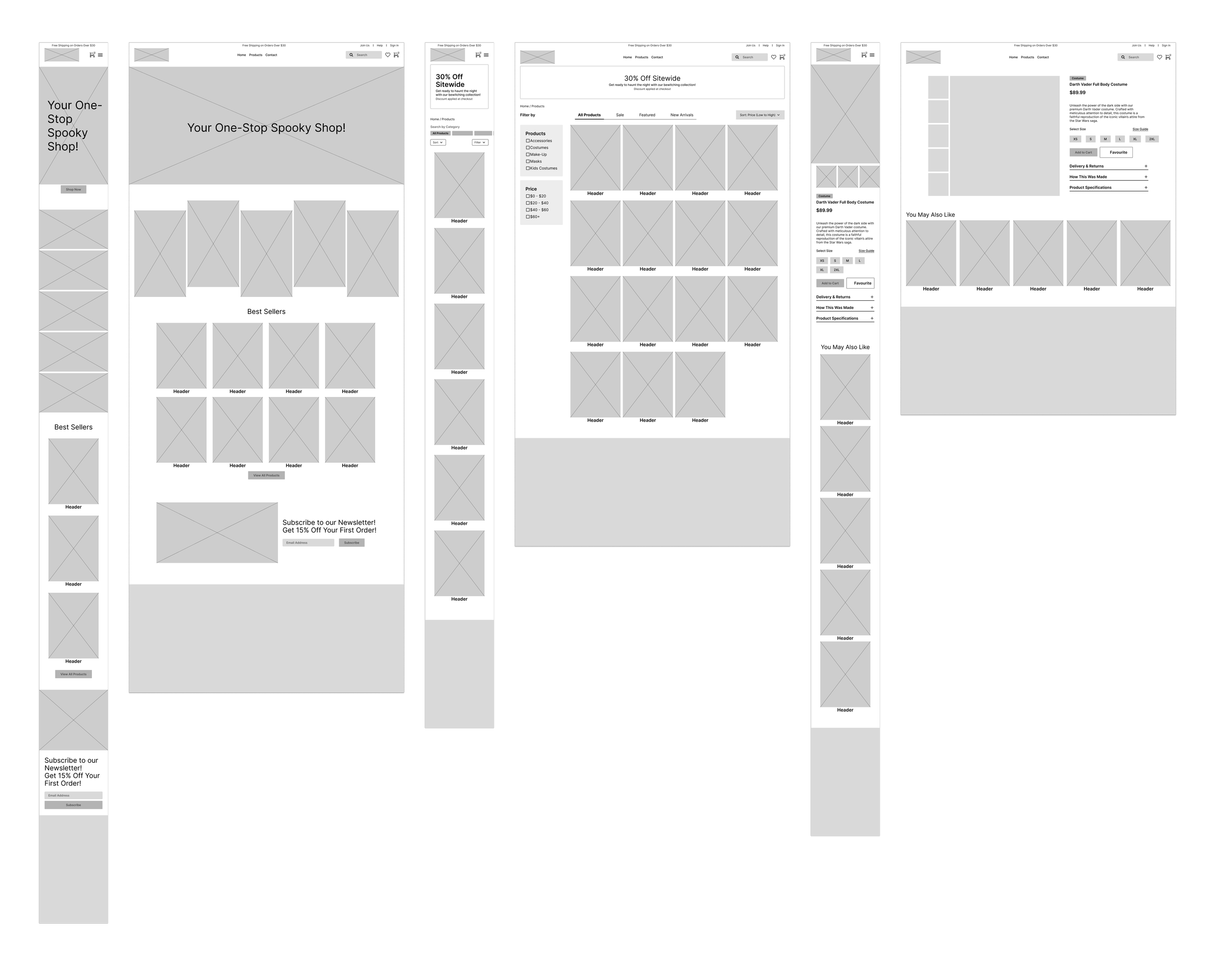
Wireframing
Low-fidelity wireframes were crafted in Figma to illustrate the appearance of various layouts and to evaluate the proposed design before advancing further. The objective of this project is to arrange information in a way that streamlines the purchasing process for users.


Brand Refresh
For Halloween Solution’s brand refresh, we propose embracing a dark theme to evoke a professional and mysterious atmosphere, perfectly aligning with the Halloween spirit. The primary color palette will feature:
By integrating these colors into a dark-themed UI, we aim to enhance the user experience through improved readability, intuitive navigation, and an engaging visual identity that resonates with the Halloween theme. This approach will not only attract and retain visitors but also ensure that the website is accessible and user-friendly for all audiences.

Design Systems
Using auto-layout and creating variables and tokens ensures brand cohesiveness and consistency. This approach streamlines the design process, ensuring that any changes made to tokens automatically propagate throughout the entire design system, thereby promoting a unified brand identity across all screen sizes.
Variants were also created to allow future designers to easily swap instances and assets as needed, while providing developers with an overview of dimensions and specifications.
Responsiveness
Multiple user interfaces were designed in Figma for both mobile and desktop sizes to ensure the site is responsive across all platforms. These visual aids help developers understand how the layout will adapt to different screen sizes and what key elements will look like when scaled down.
Accessibility Design
To ensure that the website is fully accessible and inclusive, contrast checks have been implemented for text and colour as well as colour-blind simulations to guarantee individuals with visual impairments will be able to navigate through the site seamlessly.
Results
Enhanced Search Capabilities: Users can now filter products based on categories, price ranges, popularity, and other relevant criteria. This significantly reduces the time and effort needed to find desired items.
Improved Navigation:
Intuitive Layout: The site’s layout has been reorganized to make it more user-friendly. Clear menus, well-defined sections, and logical flow ensure that users can find what they are looking for with minimal clicks.
Enhanced Brand Presence:
Memorable Branding: The site has been rebranded to reflect a unique and memorable visual identity. This includes the use of thematic colors, fonts, and graphics that resonate with the Halloween theme.
-

User Satisfaction Rate
-

Improvement Rate for Task Completion
Key Takeaways
Testing. Testing. Testing: Regular user feedback and testing allowed us to identify pain points and address them effectively, ensuring the final product meets user needs and expectations.
First impressions matter: Consistent use of colours, fonts, and graphics helped to reinforce the brand’s presence and made the site more engaging. The more interesting it is, the more memorable the experience is.